Captions play an important role in the accessibility of theatrical productions for all audience members, particularly those who are d/Deaf and hard-of-hearing (DHOH), neurodivergent, and/or living with sensory processing disorders. Secondary to their use as an accessibility tool, captions are an important visual element of a theatrical production and should be approached with the same thought, artistry, and attention as design elements like lighting and projections. This is where the concept of creative captions come in.
Creative captions are integrated into the set and developed alongside lighting and projections to ensure visibility and legibility. This process introduces discussions of captions and accessibility from the first production meeting and allows the development of the production to affect the caption design.
So how does one approach creative caption design?
I have worked on a variety of productions as a caption designer, most while I was a student at the Rochester Institute of Technology (RIT). I’ll use two of these projects, Unstageably Fresh Gynt and Macbeth, as case studies in creative caption design. My work participates in a growing landscape of access work in theatrical spaces, from creative captioners like Tim Kelly to access dramaturgs—as introduced in an essay by Alison Kopit, Ann Marie Dorr, and Maggie Bridger—and disability-centric artists such as Morgan Skolnik.
The Landscape of Captioning
Approaches to captioning in theatre include closed captioning, with captions on devices used by individual audience members; open captioning, with captions all audience members can see; and creative captioning, a form of open captioning incorporated into the design of the show.
With apps like GalaPro, closed captions are an accessibility tool offered to audience members that require them to opt-in using their own devices. At theatres with the resources to provide open captions, they are most often prewritten captions displayed on a three-line LED screen and run live by a captioner in the audience. The company StageText, for example, is a deaf-led charity that works with theatres, museums, and presenters in the United Kingdom to provide open captioning using a three-line LED screen set on or near the stage.
Open- and closed-captioning serve similar but different roles: closed captions are individualized, with the formatting often controlled by the user. They are typically available at most or all performances for a given production. Open captions allow for less distracting accessibility for the user, as the captions will be closer to the action of the show. They are often only available for a select set of performances in the run of a show. Open captions are also more communal, as the entire audience has access to them instead of opting in individually.
Creative Captioning builds on the foundation created by open- and closed-captioning to establish the accessibility tool as a design element that participates in and supports the world of the show. Formatting such as color, font, placement, line breaks, timing, and speaker attribution is approached artistically alongside scenery, lighting, projections, and sound.
Dramaturgy in Captions
In the design and production process, one role of dramaturgy is to advocate for the audience. Captions connect to dramaturgy as a form of the script that supports and contextualizes the acting and directing choices onstage. Creative caption design asks the dramaturgical question of what information can be delivered to the audience to support their engagement in the production. In this way, a dramaturgical perspective can enhance the audience’s comprehension of the show, whether they use captions to follow the dialogue or not.
Dramaturgical considerations in captions can be applied to various design elements. For example, text color could be matched to costume design for the most efficient identification of the speaker, or it could represent a characteristic of the character. Different fonts create different perceptions of tone and status. Placement of captions onstage can mirror blocking. Even punctuation and line splitting (the practice of choosing how a line of dialogue is split between captions) will impact the audience’s perception of the production. Descriptions of sound are also a great opportunity for dramaturgy, as describing the intended feeling or impact of a sound in addition to the literal description (i.e. “bittersweet piano music”) is more accessible.
Case Studies: Unstageably Fresh Gynt and Macbeth
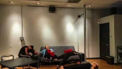
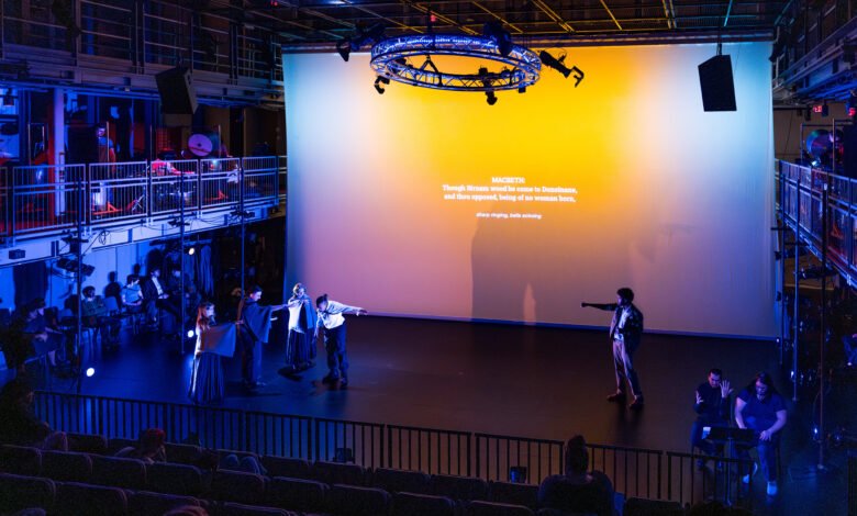
Unstageably Fresh Gynt, produced at RIT in the fall of 2024, consisted of Virginia Woolf’s Freshwater as its first act and a physical theatre adaptation of Henrik Ibsen’s Peer Gynt as its second act. The shows shared a production team and crew but had different casts, directors, and stage management teams. I was a student caption designer. In 2025, I returned to RIT professionally as the caption designer for a physical theatre production of Shakespeare’s Macbeth. Each show held unique challenges and solutions to various captioning elements.
Caption Placement and Program
As with any other theatrical design, the caption designer should discuss how the captions will fit into the vision for the show as a whole. The designer also needs to know as early as possible where the captions will be located and how they interact with other design elements. An ideal caption background is static, flat, and entirely one plain color—preferably gray or a dark shade.
Captions in Unstageably Fresh Gynt were projected onto a dark brown wooden board upstage and vertically center. Benefits of this included its set location, the ability to light it separately from the backdrop and stage, and a consistent, monochrome background for the captions. There were small disadvantages in the range of font sizes that could be used and the shadow the wooden board cast on the backdrop. These captions were built on Google Slides and run through Keynote, which allowed them to be built outside of the rehearsal space and by multiple people simultaneously, though formatting proved time-consuming and fickle.